WELCOME TO THE DEVELOPMENT OF THE SITE YOU ARE ACCESSING

if you did not mean to click here, click this instead.
JULY 11, 2024
New PORTFOLIO section of the site's up and running. It was fun to get to draw new site buttons, I haven't done any since October. Along with that I set a link in ART to redirect to my TUMBLR archive. And I'll probably do the same for a traditional TUMBLR blog as well. That I have to make first. But that sort of solves my issue to "How do I upload and maintain a gallery of the hundreds of pieces I've done?" because the answer is "Don't, at least not on WWW.APROXM.COM. I already uploaded everything I'd ever had done to TUMBLR years before so why not reap those fruits, right. Anyway I'm excited to be continuing my chipping away at the site's construction signs, but many still exist, and there's also plenty of other obligations and work soaking up my schedule... But I feel envigorated thinking, knowing that this site isn't going to be unfinished forever.
JUNE 25, 2024
Hello from exactly 7 months in the future. I've been going through the wash hahaha. I nearly went homeless. But I'm somewhat on my feet and for some reason I want to get back to work ridding this place of its perpetual construction. I'm happy to say I've got a newly finished page: check out my dj sets.
I also flipped through all my .htmls to do some minor tweaking and editing and such. Like now GYNOGENESIS and GETTING TAKEOUT WITH MY HOT WIFE both have their own unique link colors, just like THE WIND WAKER REWRITTEN's had since I made it. On that note I fixed an issue with the GYNOGENESIS page that's puzzled me since the start which is cool. On the immediate to-do is to fix the recipes on the recipe page and make a new one for my tracks so that the music page is fully complete. Well, I say that, but I guess I could have a reviews button there, too. But then I have to do the reviews page... Busy busy busy.NOVEMBER 25, 2023
It took quite a lot of effort and more days (and more breaks) than I thought... but I've finally got all my short stories, poetry, and skits archived right here on WWW.APROXM.COM. The great majority of it is crap but, for the same reason I have all my art archived on tumblr, I think it's cool to be open about previous work. Yeah, I'm calling you out if you're the type to delete old pieces. Consider yourself called. Anyway, I guess my focus'll next be on reviews... and a secret project.
NOVEMBER 1, 2023
New store image.

OCTOBER 31, 2023
Happy Halloween. I've created a new page under the Writings umbrella: Learning Materials. They've just been gathering dust so. I also rearranged this page so that it goes newest to oldest, rather than the opposite which was sure to wear out my thumb before long, and maybe yours, too. And speaking of dust, I've been getting all my old writing ready for upload'n'archiving. Most, if not all, of them are embarrassing--but if I don't feel all that different about my current works, what's the point in hiding them? I've also been working on getting a storefront up and ready--you'll know when that day comes 'cuz there'll be a big ass STORE button on the homepage. Ok Ok no more reading eat Crunch bars
OCTOBER 12, 2023
Last button done, I think--good lord it sucked doing all those Minecraft ones. Okay. Back to Dragon Quest Builders 2.
OCTOBER 8, 2023
Check this out.

Yup, no more visitors being redirected to default neocity page templates. Click on one of the many buttons across the site (which, asides from Minecraft, are now done). I wish I could do more... so sleepy. Hopefully more work follows tomorrow.
OCTOBER 5, 2023
So many sub-buttons drawn. So many yet to be. These hands were made for drawing.
SEPTEMBER 28, 2023

Goodness. I knew I probably wouldn't have much time for webdev during the same month as the Spooktober VN gamejam... but, well, I really barely worked on that either. It's been an exhausting paycheck to paycheck month. Don't have much else to say on that. But I do have a lot to say per WWW.APROXM.COM's homepage... like for instance, that it's done! More or less. New APROXM landing images. An AI warning. E-begging. And 9 whole distinct different chunks of the website all representated by a variety of childish scribbles... and that's not all. Those scribbles chase you page to page under the guise of a 'navigation bar'. Think it's neat? Now even your grandpa couldn't get lost on my site.
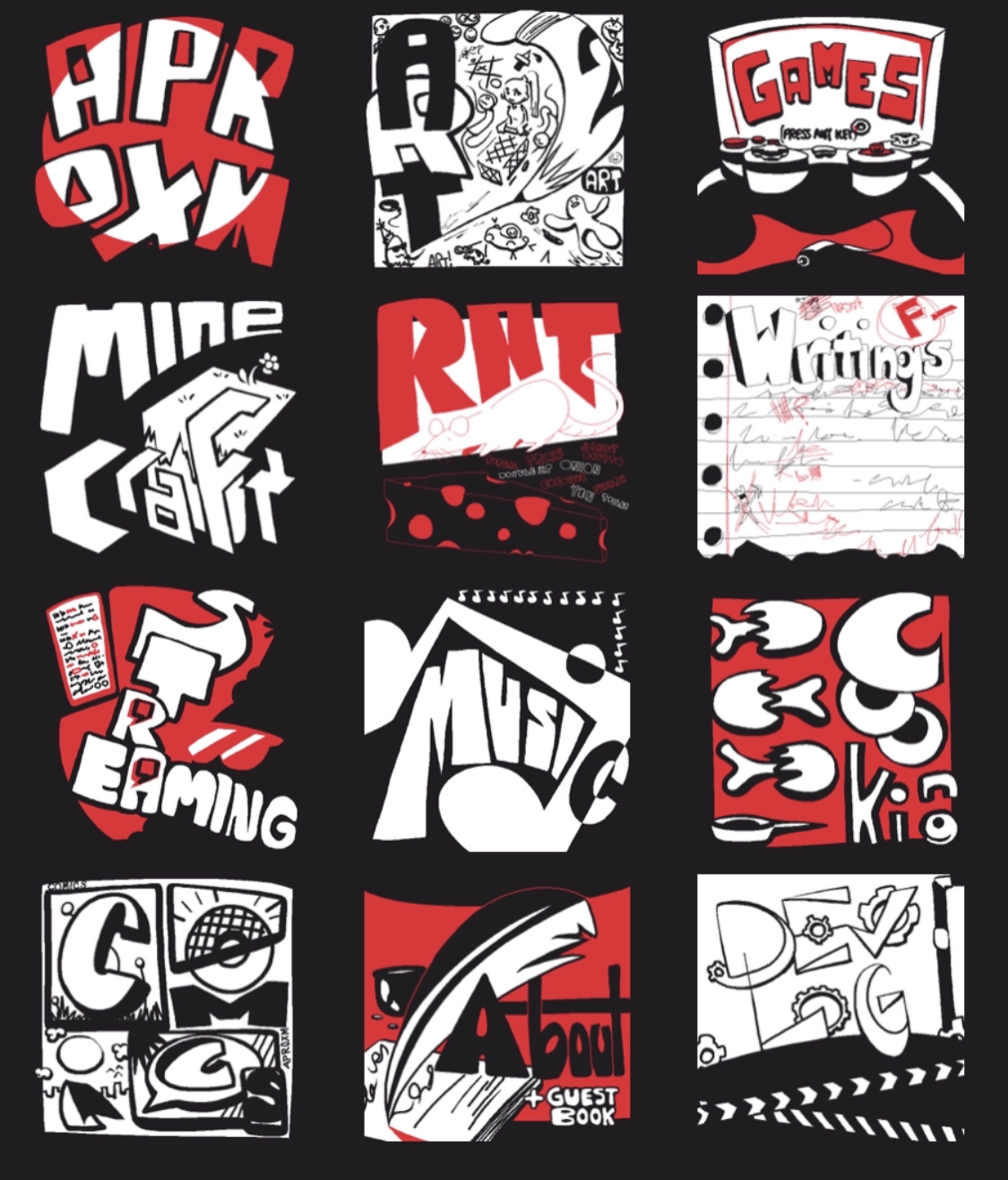
That's pretty much how I'm imaging the whole site's navigated by the end of its construction: childish chunks directing visitors all around to whatever interest(s) they care about. There'll hopefully be a little bit of WWW.APROXM.COM for everyone.

AUGUST 30, 2023
I've been so busy... but check out these covers I whipped up for GOING FOR TAKEOUT WITH MY HOT WIFE.


Anyway, I'm going to stop updating the dev diary for a bit. Seems silly that I'm spending all this time formatting dev entries and writing all these useless first steps bit by bit. I'd rather just nibble away at the site at will. I'll resume the blog when it's more for writing up... you know, BIG changes. Not, um... wrote a line. Wrote a line. Made something italicized. Wrote a line,
AUGUST 28, 2023
Phew... I was too exhausted to update the dev log yesterday, but somberily and I made some decent progress on a few things. For starters, the site has a "FAVICON" now. "FAVICON" is the little icon in the tab for www.aproxm.com. Here he is below in full quality:
This would end up being the third iteration after two... poorer attempts. Here's the first try, for instance:
It's not the most creative thing in the world: a scarlet letter A. But I'm sure you can figure out another reason why I decided this one wouldn't work.
Notice the difference between this and the final "FAVICON"? Eye see it. Anyway, my current upcoming tasks: do the box art for Turnabout Holocaust & GOING FOR TAKEOUT WITH MY HOT WIFE, implement the random image javascript. And whatever else!
AUGUST 26, 2023
Patched up last night's second "APROXM LANDING PAGE ART", and I ended up doodling a second "ERROR 404" in the process.

Decided to move forward with utilizing some javascript on the site re: rotating in and out different "APROXM LANDING PAGE ART" and "ERROR 404" pieces so that site viewers should see something new on every home page visit, and maybe getting unique art every time you run into an unexpected site error'll make you less upset about said error? I dunno, but it's happening. I've got somberily looking into what I can replace or redirect the javascript loop code with though in the event a visitor's js is broken or disabled--I don't want them just staring at a garbled mess I pay $67 a year for. The ideal would be to have... something there. She'll see. We'll see!
In the meantime, I've managed to draw a banner for the games section of the site. Like the "APROXM LANDING PAGE ART" and "ERROR 404" pieces, I hope too one day to have randomized, rotating "GAME".

It originally was just grayscaled, but I couldn't resist a dip into the sanguine. And that word's on the mind cuz I just recently finished his Daedric quest (Oblivion obliviously)--but this is a dev diary, not a diary diary (coming soon?). The games I can talk about here are The Wind Waker Rewritten and Gynogenesis, both of which I uploaded the box art for right next to each other all cozy like. I think I already wrote a dev entry about how you'll be able to click these and--anyway, I gotta draw two more box arts if I'm going down this route, since I never ended up doing any for Turnabout Holocaust nor GOING FOR TAKEOUT WITH MY HOT WIFE. That'll make four neat and tidy boxes shelved next to each other... and then a fifth the end of September. And a sixth once me and nick ("nicozzard", "nicodile", "FORD RUST") get our broken Ludum Dare 53 entry fixed. And a seventh once...
Oh, speaking of games, take a peek back up at the Dishonored 2 screenshot I posted earlier. Hover over'er. Pretty cool right. Somberily again, cheers. I also had to spend some time tweaking the "ERROR 404" piece I whipped up today, too, lol.
AUGUST 25, 2023
Decided I liked the red after all. It's tough to nail a good sitewide color--i feel like an orange or yellow accent's just going to make a site viewer think of Halloween, and while that'll be fine while I work on my Halloween-themed game, it'll be kind of strange afterward, and I am not doing red and green the month after. Or well, I guess that's not entirely true--I'm doing Christmas colors now. Yellow inbetween, too. Ready, set, go, right? In the end, the red suits me. Or maybe www.aproxm.com suits red.
I managed to knock out some art for the landing page--here they are below.
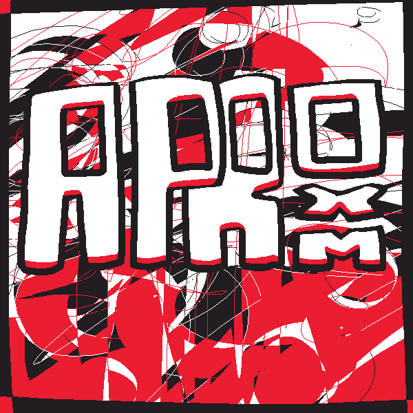

Like with the "ERROR 404" image, I hope to also have my "APROXM LANDING PAGE ART" cycle through a handful of pieces sometime. Alas, this will likely require Javascript...
AUGUST 24, 2023
Well, the only website development I ended up doing last night before passing out was on my "retired" carrd. I figure with my halloween visual novel's development starting and ending by next month, I may as well squeeze a little more life out of the site with ooooone more redirect. Just doubting this website'll be done before then, realistically.
Today, I've been messing with the visual identity of the site. I went into tegaki and swapped "ERROR 404"'s flavor of black to match that of "devlog". Then I dove into the CSS and set the background color of the site to match said flavor, specifically #211d21. Thinking having a blindingly white default bg isn't really "in" anymore these days, plus it's a pretty nice tone It sure is taking awhile to reflect that CSS change on my end, though... I'm sure any second, now.
In addition, I've been scouring google fonts for a bunch of fonts I want to throw at the site. I really like the Dishonored 2 menu UI, so something somewhat in that ballpark would be cool long-term. Short term, it begins with some .ttf files.
AUGUST 22, 2023
I'm logging in pretty late tonight, so there's not much I've set out to do. I went ahead and corrected some typos I made in last night's entry, and I scaled the rest of the images I've hosted on other parts of the site. Um, and I swapped the wording of 'here' and 'this' because it didn't sound right the way they were.
I started a page for my games and romhacks, titled "GAMES & ROMHACKS", but in order to move forward I'm gonna have to figure out how to make clicking art lead to URLs. I'm sure it's a simple task...
AUGUST 21, 2023
My friend rook (rook) showed me a potential way to tackle the wanting-different-rotating images problem I ended AUGUST 20, 2023 with. It involves some javascript... hesitant after learning about a site that ranks websites by how little javascript they use (with a name escaping me right now). I'm probably just overthinking it, though, I get that java's just another HTML or CSS... except I barely know the former and don't know the latter at all. lol...
The "ERROR 404" page art upload was a success btw, though I imagine you'd probably guess that since the "ERROR 404" image above loads correctly. But did you notice it scales properly with screen width? Or at least is supposed to? Cuz it didn't do that before this "w3schools" HTML tutorial. I hope to steal many more lines of code from their site, too... probably some of the CSS and Javascript ones, too.
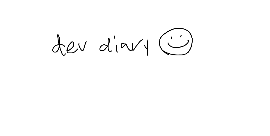
Oh, and I replaced my "devlog" image placeholder with some actual art. But for memory's sake, here's what I replaced down below.
AUGUST 20, 2023
Today, I've created this "WEBSITE DEVELOPMENT LOG". I think keeping diary entries of my progress in building a website might help in doing the same for developing games, something I didn't bother with for The Wind Waker Rewritten or Gynogenesis much to my current regret. Thus, "WEBSITE DEVELOPMENT LOG". Let's learn building a website together.
Additionally, I set up "legacy.html" which is what the current homepage looks like, linked above the AUGUST 20, 2023 entry. I also drew an "ERROR 404" image for the "ERROR 404" page, which is hopefully working but I can't tell if I either screwed up the html or the site's just slow to show change... tomorrow we'll find out which my fate is. The image is below.

I hope I can figure out some way to rotate between a collection of different "ERROR 404" page images.

The site'll likely never look as complex or interesting as this, though. That's also just being realistic. I have so little idea what I'm doing--but it seems important to at least cement some strong readability to the site overall... even though the only thing to read right now is a development blog about a site that only otherwise features a link to a development blog. But let's try not to get lost in... all that.
My previously mentioned friend somberily (somberily) helped me with some other cool HTML and CSS stuff today: got all the text aligned a bit so the presentation should look pretty similar whether on mobile or desktop. There's some slight padding, text is aligned, oh and there's about a dozen APROXMs that shoot out from both sides of the screen on the homepage. Also new custom URL colors that I'll probably change tomorrow... red seems a bit too sinister for my content. Maybe once I go through my creepypasta rebranding in 2025.
AUGUST 19, 2023
"www.aproxm.com" is born, and it began with reaccessing an old neocities login and creating a new basic webpage. To prove some level of investment to myself, I edited the provided template to this soon-defunct landing html. It's bare, but it was enough. I (aproxm) with the assistance of somberily (somberily) then purchased a domain ("www.aproxm.com") and stapled it onto the neocities site (which you are accessing right now). And then I went to bed.
